Working with Data Frames
In this lesson we will learn how to work with data in a data frame.
Learning Objectives
- Create objects, differentiate data types, understand logical comparisons
- Use the pipe, access variables in a data frame
- Create frequency tables and barcharts
Meet the Penguins
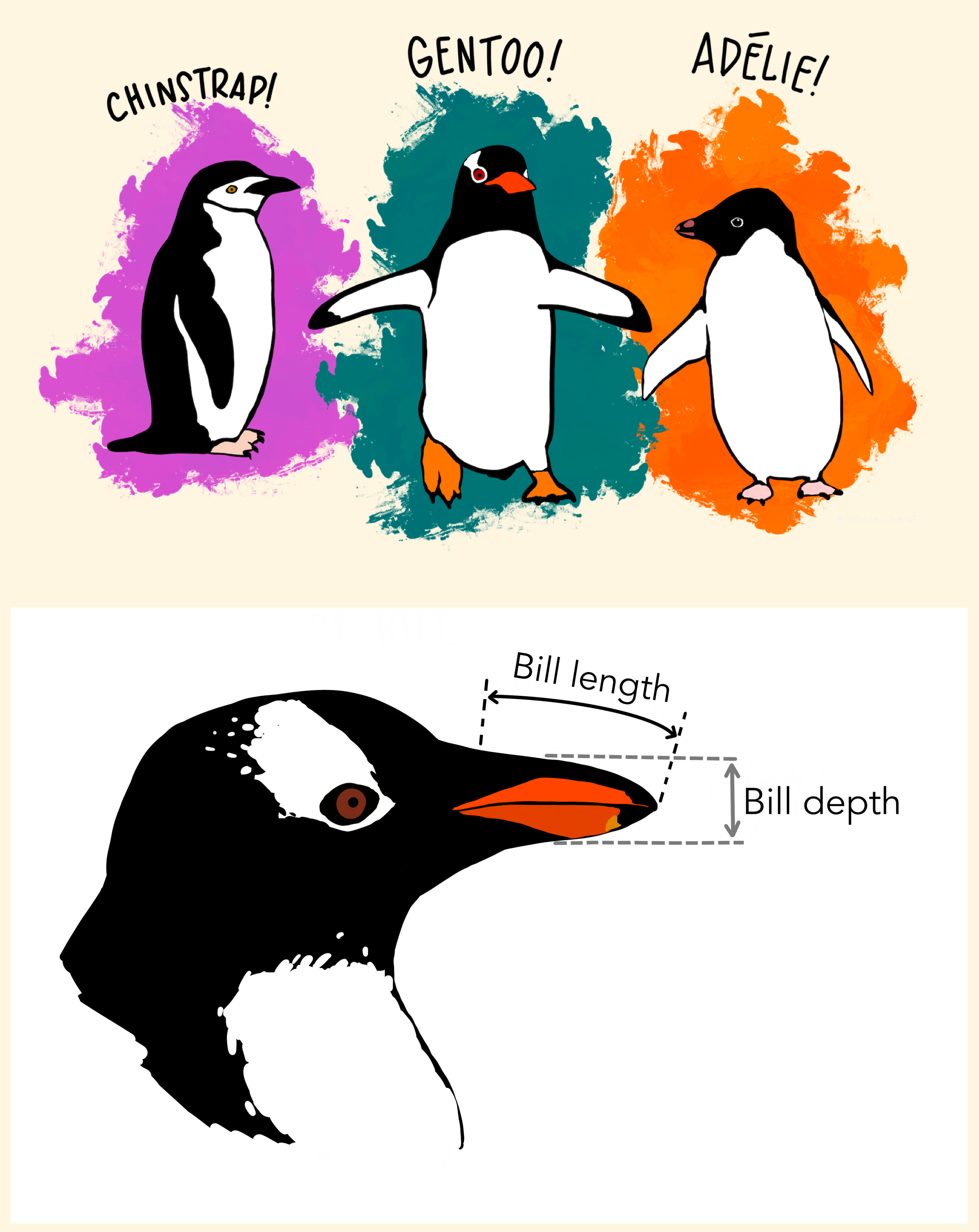 The
The palmerpenguins data contains size measurements for three penguin species observed on three islands in the Palmer Archipelago, Antarctica.
Terminology
Structured Data is spreadsheet-like data, rectangular with rows and columns.
- Each row is a single observation
- Each column is a variable or characteristic, of the observation
tidy data. This is an important concept that you are encouraged to read more about if you will be doing your own data collection and research. https://www.jstatsoft.org/article/view/v059i10Unstructured Data is text, audio and images.
We will learn how to use R on structured data first, before we get into working with unstructured data (text)
Data Frames
Reference: Math 130 - Section 3.6
A data frame is R’s version of structured data.
- All columns are vectors that have the same number of entries
- Because columns are vectors, each column must contain a single type of data (e.g., characters, integers, factors).
For example, here is a figure depicting a data frame comprising a numeric, a character, and a logical vector.
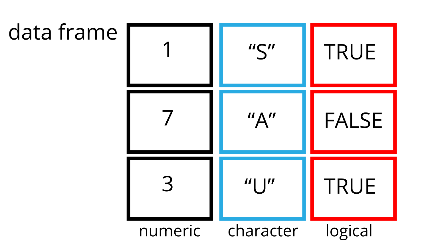
For this part of the lesson we will use a data set called penguins that comes with the palmerpenguins package that we installed for you. In a later lesson we will learn how to import data from an external file into R. We can load the penguins data set into a new object called pen by typing the following.
pen <- palmerpenguins::penguinsLet’s look at this data
To see the raw data values, click on the square spreadsheet icon to the right of the data set name in the top right panel of RStudio (circled in green in the image below).
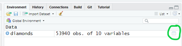
This area also tells us a little bit about the data set, specifically that it has 344 rows (observations) and 8 variables (columns).
When data sets are very large such as this one, it may be difficult to see all columns or all rows. We can get an idea of the structure of the data frame including variable names and types by using the glimpse function.
glimpse(pen)Rows: 344
Columns: 8
$ species <fct> Adelie, Adelie, Adelie, Adelie, Adelie, Adelie, Adel…
$ island <fct> Torgersen, Torgersen, Torgersen, Torgersen, Torgerse…
$ bill_length_mm <dbl> 39.1, 39.5, 40.3, NA, 36.7, 39.3, 38.9, 39.2, 34.1, …
$ bill_depth_mm <dbl> 18.7, 17.4, 18.0, NA, 19.3, 20.6, 17.8, 19.6, 18.1, …
$ flipper_length_mm <int> 181, 186, 195, NA, 193, 190, 181, 195, 193, 190, 186…
$ body_mass_g <int> 3750, 3800, 3250, NA, 3450, 3650, 3625, 4675, 3475, …
$ sex <fct> male, female, female, NA, female, male, female, male…
$ year <int> 2007, 2007, 2007, 2007, 2007, 2007, 2007, 2007, 2007…This shows us the following information
- Number of rows and columns
- The variable names
- The variable types (classes)
- Actual data values for the first 6-8 rows for each variable
We will be exploring variables such as species, body weight, the island and flipper lengths.
Inspecting data.frame objects
Here is a non-exhaustive list of functions to get a sense of the content/structure of the data. Let’s try them out!
-
nrow(pen)- returns the number of rows -
ncol(pen)- returns the number of columns -
head(pen)- shows the first 6 rows -
names(pen)- returns the column names (synonym of colnames() for data.frame objects) -
str(pen)- structure of the object and information about the class, length and content of each column
Working with variables inside data frames
Variables inside data frames are typically accessed using $ notation and their variable name.
pen$flipper_length_mm [1] 181 186 195 NA 193 190 181 195 193 190 186 180 182 191 198 185 195 197
[19] 184 194 174 180 189 185 180 187 183 187 172 180 178 178 188 184 195 196
[37] 190 180 181 184 182 195 186 196 185 190 182 179 190 191 186 188 190 200
[55] 187 191 186 193 181 194 185 195 185 192 184 192 195 188 190 198 190 190
[73] 196 197 190 195 191 184 187 195 189 196 187 193 191 194 190 189 189 190
[91] 202 205 185 186 187 208 190 196 178 192 192 203 183 190 193 184 199 190
[109] 181 197 198 191 193 197 191 196 188 199 189 189 187 198 176 202 186 199
[127] 191 195 191 210 190 197 193 199 187 190 191 200 185 193 193 187 188 190
[145] 192 185 190 184 195 193 187 201 211 230 210 218 215 210 211 219 209 215
[163] 214 216 214 213 210 217 210 221 209 222 218 215 213 215 215 215 216 215
[181] 210 220 222 209 207 230 220 220 213 219 208 208 208 225 210 216 222 217
[199] 210 225 213 215 210 220 210 225 217 220 208 220 208 224 208 221 214 231
[217] 219 230 214 229 220 223 216 221 221 217 216 230 209 220 215 223 212 221
[235] 212 224 212 228 218 218 212 230 218 228 212 224 214 226 216 222 203 225
[253] 219 228 215 228 216 215 210 219 208 209 216 229 213 230 217 230 217 222
[271] 214 NA 215 222 212 213 192 196 193 188 197 198 178 197 195 198 193 194
[289] 185 201 190 201 197 181 190 195 181 191 187 193 195 197 200 200 191 205
[307] 187 201 187 203 195 199 195 210 192 205 210 187 196 196 196 201 190 212
[325] 187 198 199 201 193 203 187 197 191 203 202 194 206 189 195 207 202 193
[343] 210 198The $ notation has the format data$variable and so can be thought of as specifying which data set the variable is in. It is easy to imagine a situation where two different data sets have the same name.
This allows us to perform calculations on an individual variable. Below is an example of creating a frequency table to see how many penguins were recorded each year.
table(pen$year)
2007 2008 2009
 110  114  120
Data Types
We saw that R has different data types: character , numeric, logical. These are specific to how programming languages see data types. Now let’s take another look at the data types in context of science.
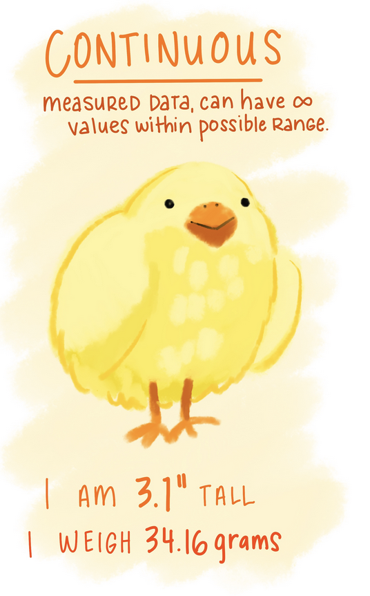
- Quantitative / Numeric (continuous or discrete) data
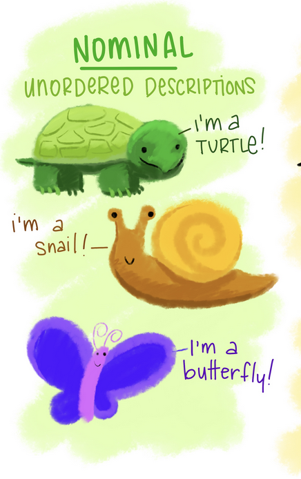
- Categorical (e.g. nominal, ordinal)
Frequency Tables
Reference: Math 130 - Section 4.1.1
Frequency tables are used only any type of categorical data (Nominal, ordinal or binary), and the table results show you how many records in the data set have that particular level.
You can create a basic frequency table by using the table() function.
table(pen$species)
   Adelie Chinstrap    Gentoo
      152        68       124
Relative frequencies (proportions or percentages) are calculated by putting the results of the table function inside the prop.table function.
prop.table(table(pen$species))
   Adelie Chinstrap    Gentoo
0.4418605 0.1976744 0.3604651
The variable pen$species has 152 (44.2%) records with a value of Adelie, 68 (19.8%) records with a value of Chinstrap, and 124 (36.0%) records with the value of Gentoo.
Visualizing categorical data
Reference: Math 130 - Setction 6.1, 6.2
Visualizing your data is hands down the most important thing you can learn to do. Seeing is critical to understanding. There are two audiences in mind when creating data visualizations:
- For your eyes only: These are quick and dirty plots, without annotation. Meant to be looked at once or twice.
- To share with others: These should have informative captions, axes labels, titles, colors as needed, etc. We’ll see how to add these features throughout this course.
The functions from the ggplot2 package, along with derivatives such as ggpubr and sjPlot, automatically do a lot of this work for you. While all of these can be made with base R plotting functions, we are intentionally choosing to highlight function that create good quality plots with very little code and are quite extensible and flexible.
ggplot2 is part of the tidyverse
- ggplot2 is tidyverse’s data visualization package
- Structure of the code for plots can be summarized as
ggplot(data = [dataset],
       mapping = aes(x = [x-variable],
                     y = [y-variable])) +
   geom_xxx() +
   other options
Required arguments
-
data: What data set is this plot using? This is ALWAYS the first argument. -
aes(): This is the aesthetics of the plot. What variable is on thexaxis, and what is on theyaxis? Do you want to color by another variable, perhaps fill some box by the value of another variable, or group by a variable. -
geom_xxx(): Every plot has to have a geometry. What is the shape of the thing you want to plot? Do you want to plot point? Usegeom_points(). Want to connect those points with a line? Usegeom_lines(). We will see many varieties in this lesson.
Barcharts
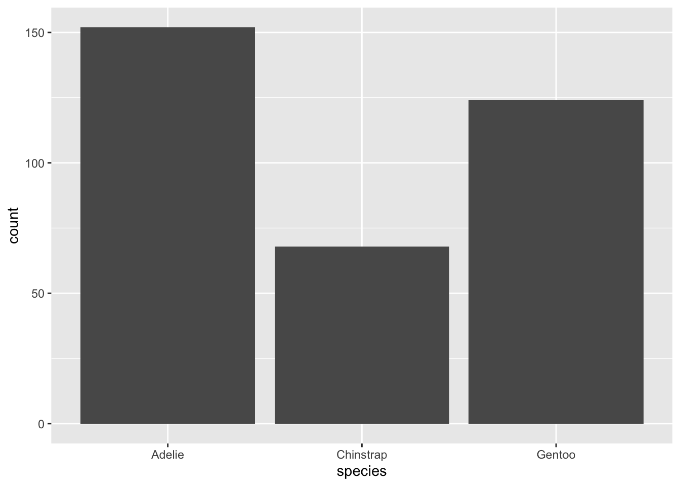
A Barchart or barplot takes these frequencies, and draws bars along the X-axis where the height of the bars is determined by the frequencies seen in the table.
ggplot
Using ggplot2 with the geom_bar() geometry layer gives us actual wide bars, and better axis labels.
sjPlot
Using the plot_frq function from the sjPlot package builds on the geom_bar() type plot from ggplot, but adds frequencies and relative percentages on the plot.
plot_frq(pen, "species")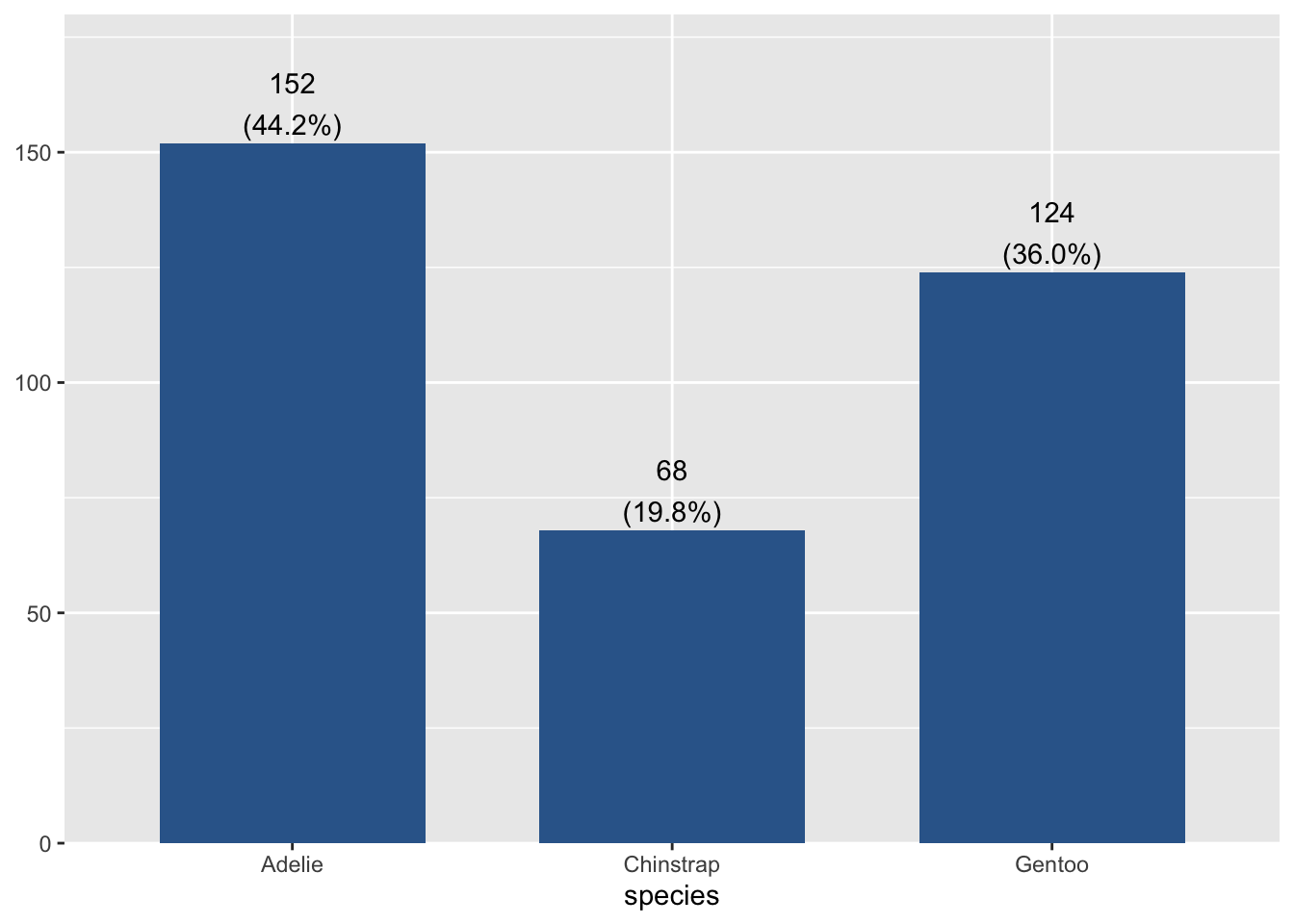
This single graph provides a lot of good information and is a recommended choice to use.
Code style
Sometimes code can be nested like the following, where the output of the table() function is passed into the prop.table() function.
prop.table(table(pen$species))R understands different styles that can be more readable, such as putting the inner function a new line.
prop.table(
  table(pen$species)
  )
As long as you either a) highlight all the code and run it, or b) put your cursor on at least one line and press CTRL+ENTER, or c) press play and run the entire code chunk - R will properly run both functions in the correct order.
Then there is a style that I particularly like called chaining.
Chaining commands
Two common styles:
-
|>This is the “native” pipe that’s built into R. -
%>%This pipe is loaded with thetidyversepackage.
They both function the same, but you’ll see both being used so it’s good to know that they both exist. That way if you are not using other functions from the tidyverse, you can still enjoy the chaining functionality.
What is “Chaining”?
The pipe lets you string set of functions together, like links on a chain, to be completed in the order specified. This works with the majority of functions, specifically when the result of the function is a data frame, a vector, or sometimes the results of a model.
“and then….”
This is what I read to myself when using the pipe. “Do this |> the next thing |> do this third thing |> this last”
This code is read as
pen$species |> table() # instead of table(pen$species)- Get the
speciesvariable from thependata set - and then create a frequency table on that variable
These may be trivial examples now but the usefulness of this approach will be apparent before the class is finished.
What actually is happening, is that the result from the code on the left of the |> gets passed into the first argument of the commands on the right hand side. Two things to keep in mind:
- Do not include the variable on both sides.
pen$species |>  ✅
  table()

pen$species |>
table(pen$species) ❌- the pipe itself must be at the end of a “sentence”.
pen$species |>   ✅
  table()

pen$species      ❌
|> table()
We’ll be using chaining a lot while working in the Tidy Text mining book.